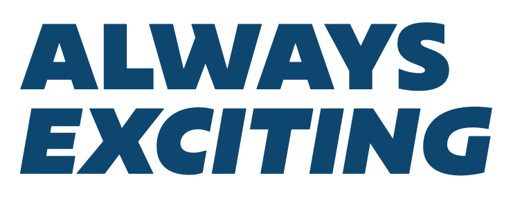
Headline
- Weight
- Extrabold, Extrabold Italic, Black, or Black Italic
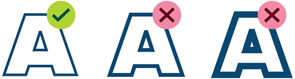
- Case
- Uppercase
- Leading
- 90%
- Tracking
- 0 Ems
Conversational Headline
- Weight
- Extrabold, Extrabold Italic, Black, or Black Italic
- Case
- Sentence Case
- Leading
- 110%
- Tracking
- 0 Ems
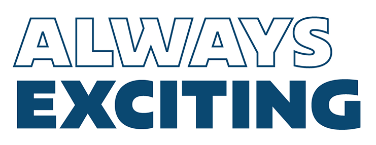
Section Header
- Weight
- Narrow: Extrabold, or Black
- Case
- Uppercase
- Leading
- 90%
- Tracking
- 0 Ems
Subhead
- Weight
- Expanded: Regular, or Medium
- Case
- Sentence Case
- Leading
- 115%
- Tracking
- -10 Ems
Callouts
- Weight
- Exapnded: Extrabold, Extrabold Italic, Black, or Black Italic
- Case
- Uppercase
- Leading
- 90%
- Tracking
- 0 Ems
Body
- Weight
- Light, Light Italic, Regular, Italic, Medium, or Medium Italic
- Case
- Sentence Case
- Leading
- 125%
- Tracking
- 0 Ems
CTA's
- Weight
- Bold, or Bold Italic
- Case
- Uppercase
- Leading
- 110%
- Tracking
- 10 Ems