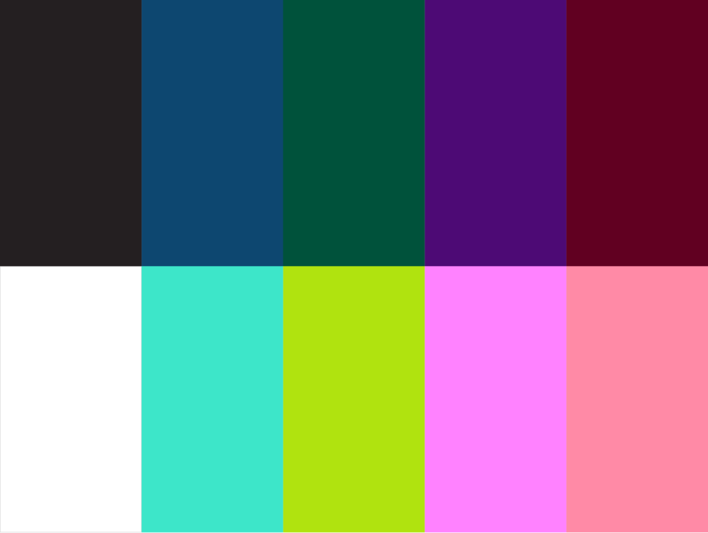
Colour
Our colours are straightforward and easy to use. The anchor colours are black and white, providing a strong, recognizable look that works across all platforms. We add vibrant colours to keep things lively and engaging, but black and white are the foundation.

PRIMARY PALETTE
Illustration colour combos can bring energy and personality to a design, but should only be used on Moraine, Blackjack, or Whiteout backgrounds. When combining colours, we’re careful not to overwhelm the layout. By keeping things simple and intentional, we ensure our designs stay clear, cohesive, and true to our brand.
Digital Values
RGB: 255/255/255
HEX: #FFFFFF
Print Values
CMYK: 0/0/0/0
Digital Values
RGB: 36/31/33
HEX: #241F21
Print Values
CMYK: 70/69/63/73
Pantone: Black 3C
Digital Values
RGB: 13/71/111
HEX: #0D4770
Print Values
CMYK: 99/74/33/17
Pantone: 654C
Digital Values
RGB: 0/82/59
HEX: #00523B
Print Values
CMYK: 90/41/80/41
Pantone: 343C
Digital Values
RGB: 77/10/117
HEX: #4D0A75
Print Values
CMYK: 84/100/18/13
Pantone: 2617C
Digital Values
RGB: 97/0/33
HEX: #610021
Print Values
CMYK: 36/100/71/53
Pantone: 209C
Digital Values
RGB: 61/229/201
HEX: #3DE5C9
Print Values
CMYK: 57/0/33/0
Pantone: 304C
Digital Values
RGB: 176/227/15
HEX: #B0E30F
Print Values
CMYK: 36/0/100/0
Pantone: 2297C
Digital Values
RGB: 255/130/255
HEX: #FF82FF
Print Values
CMYK: 14/53/0/0
Pantone: 244C
Digital Values
RGB: 255/138/166
HEX: #FF8AA6
Print Values
CMYK: 0/59/13/0
Pantone: 189C

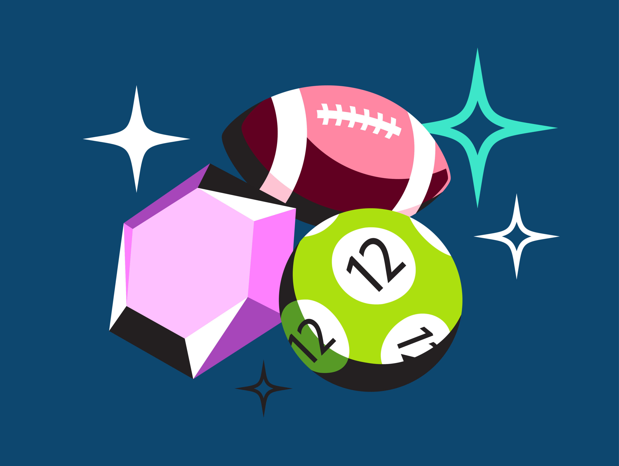
SECONDARY PALETTE
We reserve our secondary colour palette for illustrations and select graphic elements. This approach lets us expand our visual range without compromising consistency, ensuring every design feels fresh while still staying true to the Play Alberta brand.
Digital Values
RGB: 37/150/157
HEX: #25969D
Print Values
CMYK: 78/37/33/9
Digital Values
RGB: 87/154/37
HEX: #579A25
Print Values
CMYK: 63/21/90/21
Digital Values
RGB: 166/70/186
HEX: #A646BA
Print Values
CMYK: 50/76/11/5
Digital Values
RGB: 176/69/100
HEX: #B04564
Print Values
CMYK: 18/79/42/27
Digital Values
RGB: 158/242/228
HEX: #9EF2E4
Print Values
CMYK: 28/0/17/0
Digital Values
RGB: 215/240/135
HEX: #D7F087
Print Values
CMYK: 18/0/50/0
Digital Values
RGB: 255/192/255
HEX: #FFCOFF
Print Values
CMYK: 7/26/0/0
Digital Values
RGB: 255/196/ 211
HEX: #FFC4D3
Print Values
CMYK:
- 0/29/6/0
Ratio
Our colour palette is balanced. Each colour is used in even proportions to keep the brand lively and maintain strong associations with Play Alberta, no matter the platform or setting.
Colour Combinations
Moraine is our main colour, and it can be paired with any of the brighter colours in our palette. These combinations help us stand out while bridging the gap between the old and new elements of the brand.
Illustration colour combos can bring energy and personality to a design, but should only be used on Moraine, Blackjack, or Whiteout backgrounds. When combining colours, we’re careful not to overwhelm the layout. By keeping things simple and intentional, we ensure our designs stay clear, cohesive, and true to our brand.
Combinations to avoid
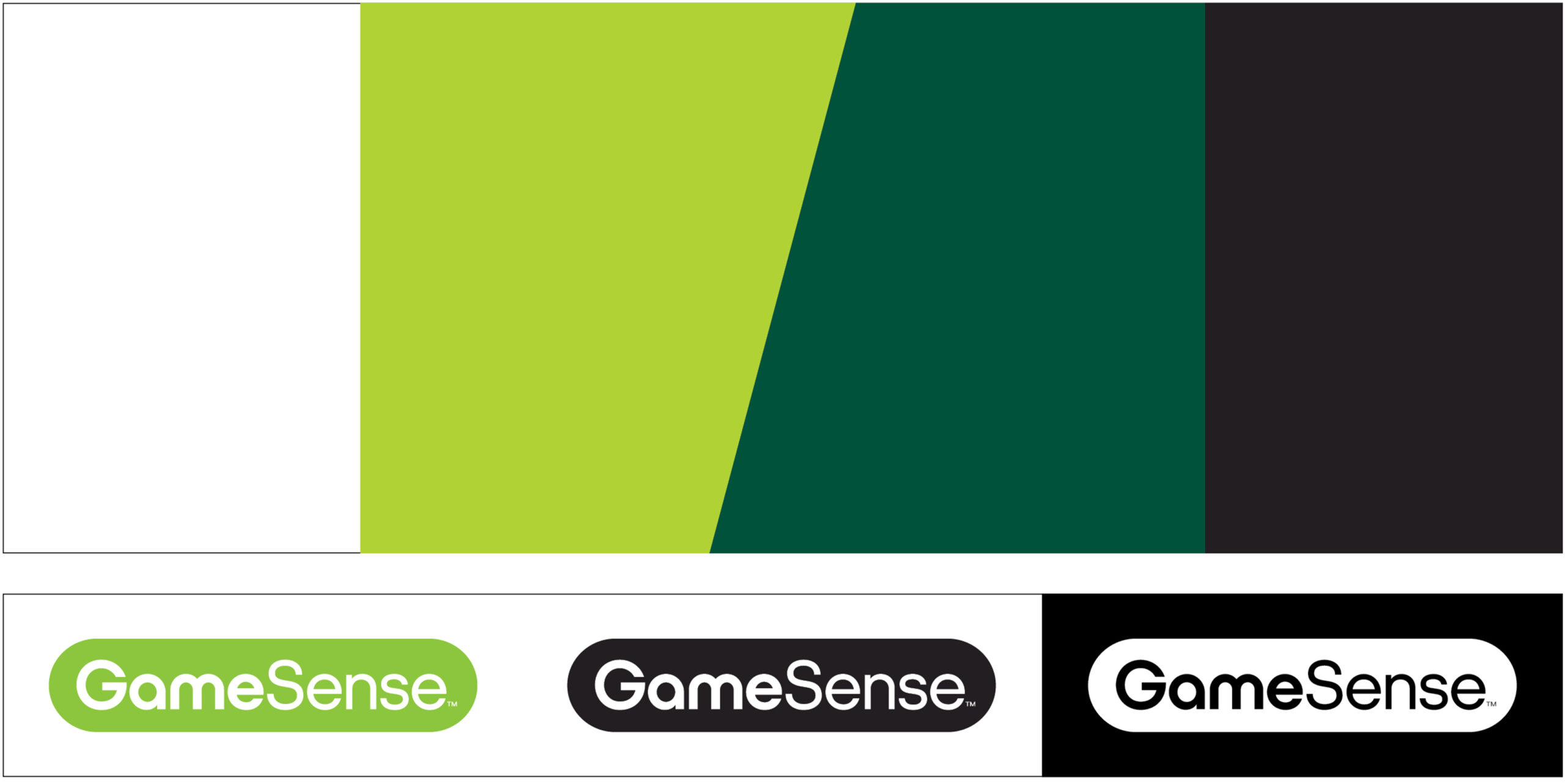
Certain colours with similar hues can blend too much and lose their impact. These combinations don’t have enough contrast and should be avoided to keep everything crisp and clear.
Our brand greens are visually similar to GameSense’s green, which can create confusion around who the message is coming from. To avoid this, we don’t use our greens in any content related to Social Responsibility or topics that overlap with GameSense messaging. This helps maintain clarity and ensures our communications are properly attributed.


Overlays
Using custom colour overlays adds variety to photos and helps them connect seamlessly to the Play Alberta brand. By applying branded hues, we can enhance our imagery with subtle yet distinctive touches that align with the overall visual identity, keeping everything cohesive and instantly recognizable.

The best way to achieve the colour overlay effect is by using a gradient map in Photoshop with your chosen colour paired with Blackjack or Whiteout. For an alternate way, apply a multiply or screen overlay effect on a black-and-white photo. This ensures our brand colours stay true to their intended tones without distortion from underlying colours.

When using black or white overlays, however, it’s better to use colour photos as the base. This keeps the image vibrant, preventing it from looking too washed out. Whiteout and Blackjack overlays should be set to 80% opacity to maintain consistency across applications.
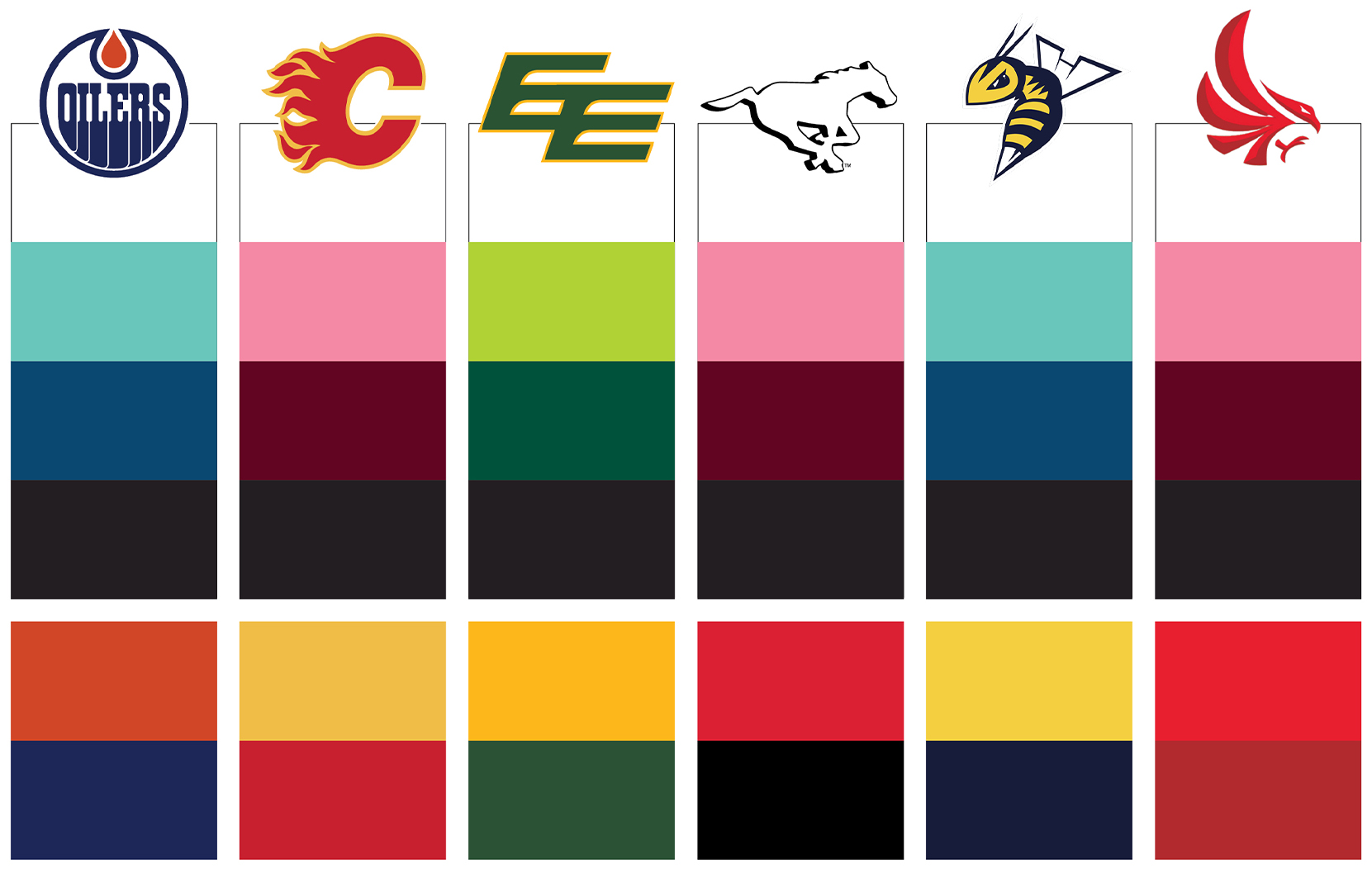
Partnerships
We treat our partnerships as true collaborations, and that extends to how we use colour. When working with partner brands, we use colours from our palette that closely align with theirs, or we may use their brand colours directly. However, we never mix our brand colours with theirs in the same design. This keeps the visual identity clear and ensures both brands are represented respectfully and cohesively.
For more information or to get approvals please email: Lisette.Maassen@aglc.ca
